Grand Meadow Heritage Center
Grand Meadow Heritage Center
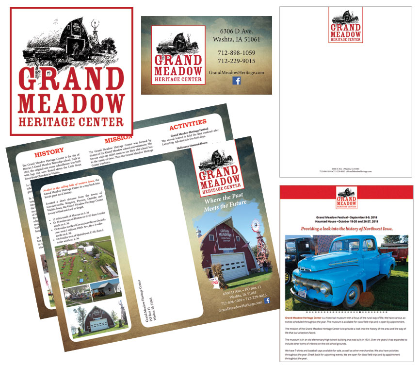
Grand Meadow Heritage Center is a historical museum with a focus on the rural way of life. They have been really hitting it hard with their festivals and fundraising, so they decided on a brand upgrade to assist with their efforts.
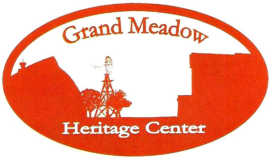
 Over there on the right was their existing logo. Now I’m not going to go into full-out logo shaming mode. It serves its purpose and with a little tweaking of the text it could be a functional logo. I liked the color they were using and understood what they were portraying. I used their color but dropped the silhouette and went with something more detailed. There’s just something rustic, classic, and timeless about pencil drawings. So I went with that.
The rebrand has helped by not only attracting new people to their festivals but also improving their perception by prospective donors and grant holders. They have been a professional and legit heritage center for a long time, now it’s just easier for them to show this through their professionally done collateral material.
http://grandmeadowheritage.com/
%
Logo Redesign
%
