
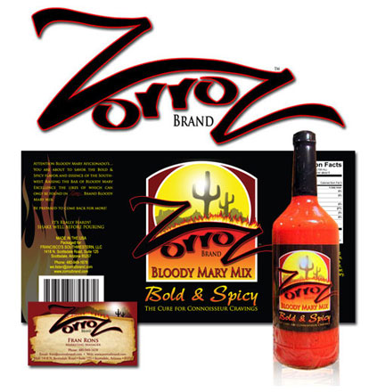
ZorroZ Bloody Mary Mix
The Challenge
This Arizona based company contacted me a few years ago looking to brand their start up company. A few bottles were mailed to me for “inspiration.” Then a few more bottles just for good measure ; )
The Solution
Our goal was to emphasize the southwest and create a bottle that stood apart from the others on the shelf. I visited about a dozen grocery and liquor stores and took photos of their mix section. I used these during the mockup process when developing color scheme and composition. The mix itself is very thick and has some wonderful color and texture. I needed to show as much of the contents as possible and still maintain a label large enough to catch the eye. Black was chosen for the color. The solid black creates the illusion of a larger label and offers an appealing contrast to the contents inside.
ZorroZ has grown significantly over the years and the owner credits much of the success to the bottle design.