by 4744ccf98ed9fcec2a3224ebb13333ed | Mar 20, 2017 | |
Sioux City Surge Football Sioux City Surge This is a logo and helmet prototype for a potential semi-pro football team. The franchise never made it off the ground but was a fun project to work on anyway. Need a sports logo? Get In...

by 4744ccf98ed9fcec2a3224ebb13333ed | Jul 17, 2016 | |
The Challenge Creek Fest was a 2 day event along the banks of Mill Creek outside of Cherokee, Iowa. As the owners entered their 5th year of throwing the event they realized the need to put a face on this monster they created. A new logo, website, and brochure resulted. The Solution The owners described the event as a 2 day, around the clock party in a pasture along a creek. I chose light colors to capture the festival party feel. Stars were added with the shaded tree to give the effect of both sunrise and sunset (party around the clock). This is a country music festival so naturally a 6 string was chosen as the logo outline. The worn typeface rounds out the rural feel. Update: Creekfest is now defunct. But man, was it a great project to work on while it lasted! % Festival Rebranding % Website Redesign Day Turnaround Amazing Weekend! When you absolutely need to promote a party in a pasture. Call the...

by 4744ccf98ed9fcec2a3224ebb13333ed | Nov 6, 2014 | |
West Fork Firearms Training West Fork specializes in conceal carry classes, based in Kingsley, Iowa. This class is different in that it doesn’t dwell too much on scenarios or combat training. Their focus is on gun safety and proper handling of firearms. This was the reason we used a downward pointed handgun as the logo. % Strategic Logo Design Effective Logo Amendment Need a logo? Get In...

by 4744ccf98ed9fcec2a3224ebb13333ed | Oct 16, 2014 | |
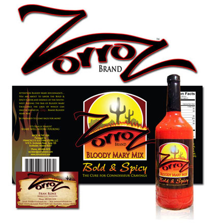
ZorroZ Bloody Mary Mix The Challenge This Arizona based company contacted me a few years ago looking to brand their start up company. A few bottles were mailed to me for “inspiration.” Then a few more bottles just for good measure ; ) The Solution Our goal was to emphasize the southwest and create a bottle that stood apart from the others on the shelf. I visited about a dozen grocery and liquor stores and took photos of their mix section. I used these during the mockup process when developing color scheme and composition. The mix itself is very thick and has some wonderful color and texture. I needed to show as much of the contents as possible and still maintain a label large enough to catch the eye. Black was chosen for the color. The solid black creates the illusion of a larger label and offers an appealing contrast to the contents inside. ZorroZ has grown significantly over the years and the owner credits much of the success to the bottle design. Fluid Ounces Steaming Hot Design Interested in working with us? Get In...

by 4744ccf98ed9fcec2a3224ebb13333ed | Oct 16, 2014 | |
Envision Custom Powerboats Logo design for a custom boat builder in New York. Need a speedy design? Get In...
